
Imagine: you're on a webpage with an enticing offer. You're excited and ready to go when suddenly, a long, bulky webform form with several required fields appears.
If we're being honest, most of us are unlikely to stick it out and finish the form, and you wouldn't be alone. In fact, according to The Manifest, a whopping 67% of users will permanently abandon a form if they encounter complications.
Webforms are, however, vital to engaging your customers and communities online. Not only do they increase both B2B and B2C account registration (which is, by the way, an important KPI for new websites) and email capture for marketing, but forms also offer the convenience for users to sign in from anywhere and proceed through checkout more easily.
There are many factors that contribute to user frustration, so follow the tips below to start addressing the usability issues on your webforms.
Encourage More Visitors to Convert
Evaluate your forms to see if they are:
- Discoverable? Text fields should stand out and indicate that users should input their information.
- Clear? Fields should be distinctly differentiated from one another.
- Efficient? Help and instructions should be provided for users to easily understand the information being requested and to address any errors in their input.
Minimize Webform Effort
It's important to minimize the level of effort for your users and reduce the amount of information they are required to remember.
Users are unlikely to read instructions provided at the top of forms, which just leads to wasted time on your part. Moreover, even if they do read the instructions, by the time they get to filling out the form, your users may have forgotten what to do.
To make your webforms more digestible, try using an asterisk or some other indicator to clearly distinguish fields that are required. This at-a-glance approach helps your users quickly determine the level of effort to expect.
Now, let's take a look at a form field, and how each individual piece can help and encourage your users to convert.
Anatomy of a Form Field
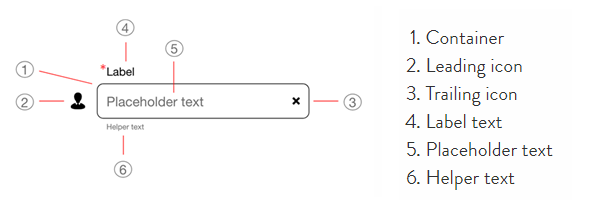
Webform Containers
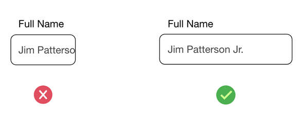
The size of your webform container should be proportional to the expected length of user input.
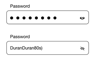
Webform Icons
Select an icon that will help users quickly understand the meaning of a field or a required action. This applies to both leading and trailing icons.
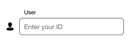
Icons can help reduce the interaction cost, which is the sum of efforts, both mental and physical, that users must deploy when interaction with a site in order to reach their goal.
In the example below, the "eye" icon allows users to see or hide what they typed.
Webform Label Text
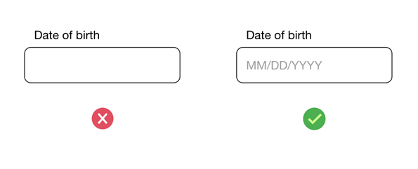
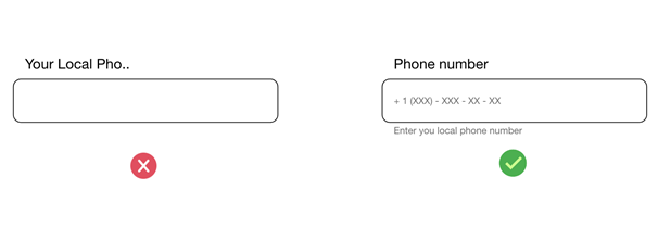
A short and descriptive label text is key to informing viewers what information is requested for a text field at-a-glance.
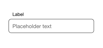
Placeholder Text
Placeholder text is what users see in the field before inputting their own information. This can help users with formatting or to clarify any confusion.
Be careful, as users scan forms quickly, they will ignore fields that already have values. To resolve this, make sure your placeholder text appears in a lighter color.
Webform Helper Text
Helper text is another assistive element that provides additional information about an input field. Some examples of helper text are an explanation of how the piece of information will be used, or requirements for the information.
Update Your Webforms
A good form (or, more often, a bad form) can be easy to identify, but are you unsure about what comes next?
Contact us to get in touch with one of our digital experts to make the most out of your webforms.
2-in-1 Download: Website Must Have's and Google Page Experience Checklist
2-in-1 Download: Website Must Have's and Google Page Experience Checklist
Recommended articles

Strategy and Optimization
Marketing and Media
Remarketing vs Retargeting? Guide to Re-Engagement Best Practices
Only 2% of web traffic converts on the first visit. Learn how retargeting and remarketing strategies work to recapture the attention of the other 98%.

Agency Life
Creative Co-Op and Inservco are Crowned Winners at dotCOMM Awards 2022
We’re so proud to announce that our clients Creative Co-Op and Inservco both took home major accolades at dotcomm’s Awards 2022.

Strategy and Optimization
Feed The Marketing Machines: Future-Proof Your Business
Whereoware CEO, Michael Mathias recently chatted with CMS Wire about the adoption of A.I. and automation in the digital marketing space.